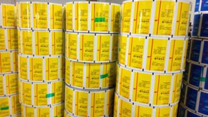
When designing composite flexible packaging from the perspective of gravure printing technology, the following points should be noted:
- The overprint accuracy of gravure printing can only reach 0.2mm. Therefore, strokes smaller than 0.4mm for text and graphics (especially text) should not use multi-color overlay printing. Instead, single-color ink printing should be used to avoid ghosting.
- When printing fine text and patterns with hollowed-out effects, it is advisable to use single-color hollowing instead of multi-color overlay hollowing. Directly hollowing out the background color of a photo for fine text and patterns is not suitable, nor is overlaying text or patterns with hollowed-out text or patterns.
- Pay attention to the size of the text and the thickness of strokes. Text that is too small or strokes that are too thin may not be printed properly, resulting in broken or missing strokes. If the text is too small and the strokes are too dense or the lines are too thick, or if the plate is too deep, “blurry text” may occur.
- The transfer performance of gravure printing is not as good as offset printing, leading to plate blocking issues. It is generally advisable to avoid using halftone dots below 10%.
Especially for large areas of background color, it is important to avoid using dots that are too light, as poor dot reproduction may result in uneven color and color shifting. Even if the printing initially succeeds, too light dots may wear out during the printing process, affecting the color and reducing the durability of the plate.
It is recommended to use spot color printing for large areas of light colors.
- Although theoretically, all colors can be produced by overlaying the three primary colors, in practice, many colors with high purity and brightness, as well as special colors such as fluorescent colors, transparent colors, gold, and silver, must be printed with spot colors. In such cases, special color rollers must be made for printing.
- Some special inks, such as pearlescent inks, require deeper rollers due to the larger particle size of the ink. Fluorescent inks and some deeper transparent inks also require deeper rollers to achieve a darker color.
Because of the coarse particles, it is generally not suitable to use shallow screen printing for pearlescent inks, gold inks, and silver inks.
- Pay special attention to avoiding overly dense patterns and lines in the longitudinal direction, as this can cause wrinkles during printing and excessive pressure can cause ink to stick.
Moderate screen hanging can be used to reduce the thickness of the ink layer.
- Bleeding issues: When one text or pattern completely overlaps another text or pattern during printing, the lighter-colored text or pattern should be appropriately expanded (generally 0.2–0.4mm) to overlap with the darker-colored text or pattern. Otherwise, the background color may be exposed at the junction during printing.
The amount of bleeding depends on the color. If two colors are complementary, black lines will appear in the overlapping area, affecting aesthetics, so bleeding should be minimized.
- Color sequence: Generally, for reverse printing, start from dark to light colors, while for surface printing, start with light colors followed by dark colors. Although they may appear different, the actual sequence seen by the human eye is the same, with dark colors appearing first.
In color printing with photographs, the three primary colors should be printed continuously without inserting other spot colors. Otherwise, it will not be conducive to overprinting of the three primary colors and the fusion of each ink layer, resulting in a poorer photo effect.
- There are differences in the thickness of screen hanging. Under the same percentage, thicker screens are easier to reproduce. However, if the dots for text or patterns are too large and thick, the lines of the strokes will not be smooth, affecting aesthetics.
When designing screen hanging, it should be noted that some colors (such as dark green) are difficult to achieve a smooth and bright printing effect within a certain percentage range, resulting in tears or wavy patterns.
